


Making education, knowledge and resources accessible to everyone has always been our commitment.
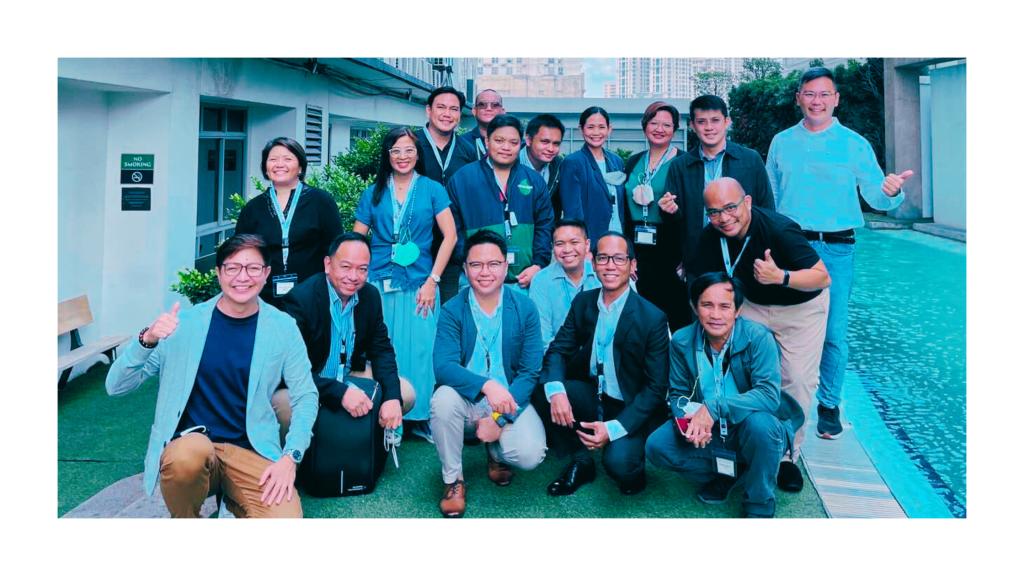
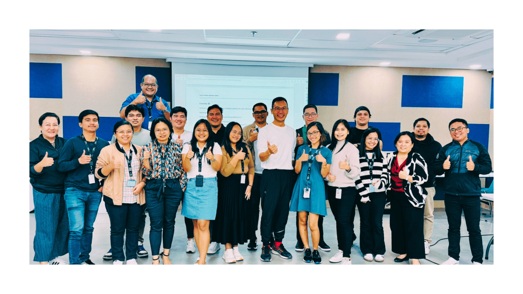
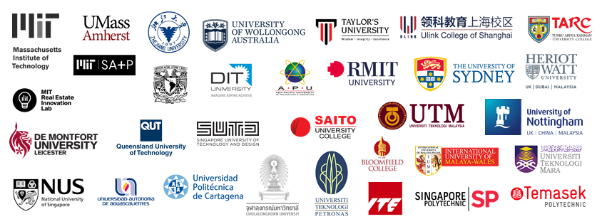
Through Certified Training Partner (CTP) network, programs are now available in 38 countries.
Contact us at hello@casugol.com for more information.
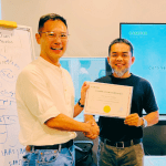
CASUGOL continuously engage with distinguished leaders, scholars and researchers in the academia around the world.
Their contribution as an Academic Partner / Contributor and active participation in our International Advisory Committee (IAC) shapes the designing of our programs to incorporate the latest research findings on frontier technologies.
Contact us at hello@casugol.com for more information.
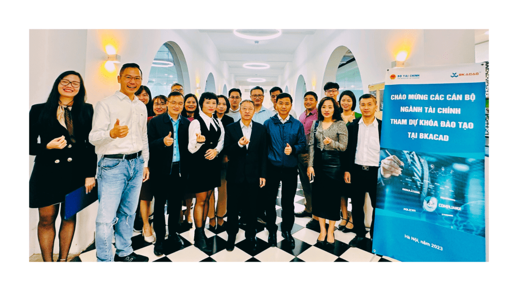
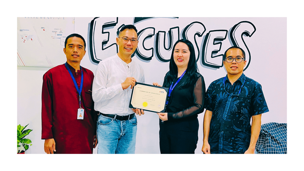
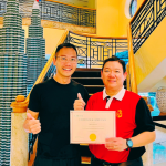
To ensure that our programs are based on the latest and future industry trend, and best practices, CASUGOL welcomes Industry Leaders from around the world who joined us Industry Partners / Contributors in the spirit of knowledge sharing.
Contact us at hello@casugol.com for more information.